The Significance of Carlo Scarpa
By William Warmus
I wrote this essay about Carlo Scarpa which was published in Glass Quarterly in 2014. It was inspired by a viewing of the landmark exhibition Venetian Glass by Carlo Scarpa: The Venini Company, 1932-1947 at the Metropolitan Museum of Art (on view 2013-2014).
I interviewed Nicholas Cullinan for the essay, the MET curator who oversaw the show’s installation and is now Director of the British Museum in London, who also gave me a tour of the exhibition. Franco DeBoni, Lino Tagliapietra and Howard Lockwood also provided background information.
Scarpism
Carlo Scarpa (1906-1978) was not legally an architect because he never sat the final exams. When he was made dean of the School of Architecture at the University of Venice in 1972, he adopted the philosopher Vico's phrase "Verum Ipsum Factum" as an unofficial motto (1). Expanding on the translation: Truth is made, you make the truth. The self is made, you make yourself. Scarpa made himself an architect by making buildings. And unlike many architects, he enjoyed working directly with the craftsmen who implemented his designs in wood, metal, stone, and glass. This process frequently slowed down the construction schedule, but the buildings Scarpa designed reveal the depth of his collaboration with the building trades, and nobody any longer cares about the delays.
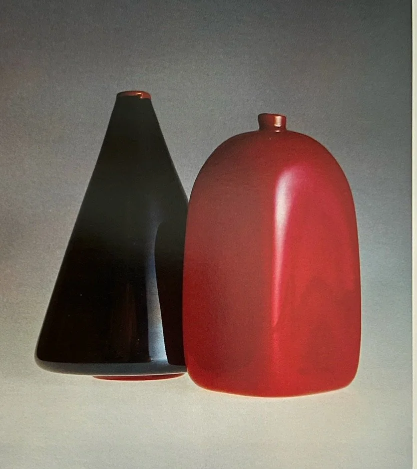
Scarpa was not a glassblower, but he made glass. First as a designer for M.V.M. Cappellin (1926-1931), and then at the venerable Venini factory (1932-1947) in Venice. He also made an income that, while modest, allowed him to maintain his interest in architecture. The two Cappellin vessels illustrated are one high point of Scarpa's modernism, as well as evidence of the success of his working relationship with the glassblowers. [ P1 ] They are austere and creative. The noir cone vase is grounded by a red disk-shape foot and completed with a casually applied red wrap on the lip. The sealing wax red bottle has an almost absurdly small neck, making the shoulders monumental by comparison. The colors shuttle: red, black, red: back and forth, varying shades. And white: fluctuating highlights of white as light strikes the squared off corners of the bottle, the slope of the cone. (2)
In this work for Cappellin, we begin to see how Scarpa the modernist was able to reconcile decoration with form, to bring them into balance. But there is a price to be paid in the most elevated, subtle works: the austere colors and shapes and details must be vibrant and well made, because that is all there is to look at, to dwell on. There is no applied dolphin or dragon to disguise a floppy or ill made vessel form.
At Venini in the 1930s and 1940s, Scarpa came into his own as a glass designer eager to explore the full range of the glassblower’s skills, minus the excess. The landmark exhibition "Venetian Glass by Carlo Scarpa: The Venini Company, 1932-1947" at the Metropolitan Museum of Art shows us that he maintained a sense of modernist restraint even as he created hundreds of bold new designs. (3) The show focuses on Scarpa at Venini, where he took delight in making thick glass embossed with bold tracks, fusing mosaic fragments only partway into lopsided wholes, and drenching unassuming vessel shapes in memorable colors like sulphur yellow, tea powder brown, greens taken from the tints of the Adriatic Sea, beef blood and straw.
A black and white photograph from 1943 emphasizes the simplicity of the working environment at Venini, showing only Scarpa and the grand master glassblower Arturo Biasutto, plus a primitive looking set of tools. Of course there were many others involved, but I get the impression of these two, architect and glassblower, set loose to explore in the venerable Venini factory, creating design after design, and I wonder about the discipline required to maintain their edge when confronted by the economics of the depression era followed by the the dark days of World War Two. We do know that Scarpa was instrumental in sheltering a prominent Jewish journalist from the Fascists at the same time that he was creating some of these triumphant works of high modernism, work that is optimistic, subtle, delicate, gently humorous, supremely self-confident: all the things I love about modernism.
The exhibition originated in Venice, curated by Marino Barovier, and was brought to the Metropolitan Museum by Sheena Wagstaff, Chair of Modern and Contemporary Art, and curated by Nicholas Cullinan, who is a big fan of Scarpa’s architecture. It occupies the entire ground floor of the octagonal shape Lehmann wing, which has a center courtyard with a stone fountain and skylight. Glimpses of natural light, water and stone in the courtyard, and Italian paintings, beyond the balcony on the floor above, background the exhibition with materials and effects favored by Scarpa in his architecture. The atmosphere is definitely not that of a blockbuster show, but although parts have the serious tone and detachment of high modernism, handsome wood and glass cases, duplicates of those used in Venice, make the experience comfortable and humane.
The sheer number of objects shown can, however, overwhelm. Where is Venini in all this, and where is Scarpa? Which are the rarefied works destined for the Biennales, which the commercial production ones? Venini and Scarpa are here intertwined, and at times we need to tease out the one from the other. Which works best represent the heroism of Scarpa, the genius? As we look at the objects in this show, we need to ask ourselves: what did Scarpa want to say to us? My impression is that Scarpa was there to calm the waters of Venetian excess, to take the Venini culture and add to it by subtracting from it, if you will. He was also there to honor tradition. Thoughtful curatorial alignments help guide and focus us so we can see these traits. (4) For example, a long case displays a group of Scarpa fused mosaic (murine) vessels, and another nearby shows ancient Roman murrines, a legacy from the past that influenced Scarpa.
These mosaics were time consuming to create, expensive, and some were destined for the Biennial exhibitions. Yet the work is pretty rough by today's standards, hardly the signature of a fancy miniaturist. There are plenty of bubbles trapped between fused tesserae (a single component block in a fused mosaic object). Some vessels are incompletely fused. And in these, I can feel the individual tesserae as I handle the object, because their edges are out of alignment with the designed shape, forming rough tactile ridges, for example in the rectangular dish (model 3772), which is made of one of Scarpa’s most famous designs, tesserae that look like black dice. Other tesserae consist of nested frames of different colors. One tesserae has an oval sulfur yellow center, framed in tea powder brown, framed in transparent red, the outermost frame of clear glass. Many of these tesserae were fused to form a conical shape functional bowl. At a distance, the bowl is the subject. Up close, each tesserae acts like a miniature symbol reading: Scarpa made me, designed by Scarpa.
A case with three large golden corroso, or corroded relief, vessels is the center of attention in another space. These are thick walled, with curious devices melted into the surface. They might represent clouds, or fish, or simply bits of glass, traces of the glassmaking process, or animal tracks in earth and snow. A pedestal nearby connects to this one by including a heavy white vase of similar style. But this display is all about white: it is a mix of different sizes, shapes, thicknesses, and techniques, all of white lattimi glass: no pure white, rather gray white, or ivory, or washed out white, or marble white.
Seeing so many white Scarpas in one place made me think of some prior research I had done connecting Venetian glass to Giorgio Bassani's novel "The Garden of the Finzi Continis," which takes place in the same World War II era in Italy. The narrator observes in a dream that "the lattimi were not at all objects of glass, as she, Micol, had tried to make me believe, but on the contrary, just as I had supposed, cheeses, small dripping forms of a whitish cheese, bottle-shaped.” This thought brought a smile to my face and made me feel a little mischievous as I contemplated converting the precious Scarpa's into cheeses, and with the permission of the great novelist Bassani. There is quite definitely a dry witty side to Scarpa: it can be difficult to figure out how to open a Scarpa door, or even how to walk up a Scarpa staircase. So why can't a Scarpa vase be a cheese? Call this Scarpism. It is the reason I adore Scarpa: finesse with detail while keeping a steady eye on the look of the whole project, unabashed exhibitionism, dry humor, and dreaminess.
We dream at night, and Scarpa made night visits to the sites of his buildings with a flashlight in order to illuminate and bring into focus details that would be washed out in bright sunlight. This process helped him to focus and better understand how to build quality into his buildings. I wonder if he ever used a flashlight at night to look at his glass? If he did, I do not think it would be to highlight object details, but rather to view whole objects in another kind of light. I want to visit the Metropolitan Museum show at night with a flashlight to confirm my theory. More Scarpism.
Viewing the show in the daytime, catalog in hand, also provides an interesting exercise for experts rather than dreamers. The objects in the show are handmade (not, for example, blown into molds) and there is frequently subtle variation between the original Scarpa drawing, the factory “blueprint” drawing, period photographs of an object, and the object in the exhibition. I do not know enough about Scarpa to know if this variation was encouraged by him, was due to several glassblowers making the same model number but in slightly different ways, or because the design was made at a later (or earlier) date. For example, the wonderful “A Pennellate” vessels, from around 1942, which Scarpa described as composed of “large torn out color spots,” can be difficult to shape when they are composed of one soft and one harder glass color. The Scarpa design for an ovoid vase of yellow and brown shows a straight neck. The object in the show has a slightly crooked neck, and the blue and gray vases in the same case have slightly asymmetrical shapes compared with the symmetrical Scarpa drawings (models 3840 and 3952). In all these special interpretations by Scarpa in glass, it was left to the master glassblower to catch the spirit in his own inimitable manner. Maybe what we are reading are the traces of different hands.
Glass and architecture
After 1947 Scarpa devoted himself fully to architecture: his wife told him that he could not go back to his life as a glass designer. Glass still plays a role in his work, but now in the context of buildings he designed, and as one material among a host of others. In 1961 he brought together Murano flat glass, water, and color in an exhibition in Torino called ‘The Sense of Water and the Control of Color.”
Did his work in glass influence his architecture? I think so. For example, the monument to the women of the Resistance in Venice from 1968: Scarpa did not design the statue, but he did design the stone pavement, which in his drawing looks like a murrine surface.
For the enlargement of the Canova Museum in Possagno (1955-1957), Scarpa created three dimensional cubic windows reminiscent of giant glass tesserae set into the corners of one gallery. On sunny cloudless days with blue sky, these windows glow like solid blue glass blocks. They also derive from his experiences with exhibition design: they are like glass display cases plunged into the corners of the building. It is disappointing Scarpa never had a chance to repeat and refine these experiments.
The Castelveccio Museum renovation in Verona from 1957-1975 is perhaps Scarpa's most powerful creation, extraordinarily bold in the placement of the Cangrande equestrian statue that is the museum's masterpiece. He was also forceful in his treatment of a set of quite mundane doorways and glass windows at ground level in the northern wall of the courtyard.
Scarpa did something unusual: he recessed the glazing deeply, and into one doorway / window he ran a stone wall, and into the next opening he inserted a large sarcophagus like box, covered with an intricate stone mosaic, called the Sacello. The mosaic pattern reminds me of his earlier work in glass. From inside the museum, you walk through the window plane and enter into this shrine, which displays precious small scale objects from tombs.
The idea of plunging stone masses into delicate glass windows, or making windows into three dimensional structures, playing part on whole and whole on part, offers up a new and wonderful interpretation of how glass might be used in architecture. Scarpa was challenging glass to stand strong against stone but also to work with stone, and to assume more than a two dimensional role in architecture. Unfortunately, the opposite has happened in the use of glass in architecture today. Glass and stone seldom commingle, and three dimensional glass remains largely a dream.
Legacy and Legend
Scarpa's legacy in glass begins with his son Tobia Scarpa, who designed for Venini, and continues through the American artists who worked at Venini in the 1960s and 1970s: Thomas Stearns, Dick Marquis, and Dale Chihuly among many others. Outside Venini, I am especially interested in the British artist Tony Cragg because of his focus on many of the same ideas that intrigued Scarpa: the artistic appropriation of museum exhibition methods, the display of multiples of glass objects using a variety of framing devices, and his Dice sculptures, that fuse thousands of dice into three dimensional structures reminiscent of Scarpa's murrine vessels. (7) In architecture, I point to Jamie Carpenter as an heir to Scarpa's subtle yet bold approach.
At a time when the high power artworld selects the flavor of the month and then moves on, Scarpa's legacy is about staying with your art, following it through all the bizarre permutations and obstacles life creates, and accepting the subtle as well as the bold. The German artist Anselm Kiefer envisions a leaden age for art rather than a golden one; he has remarked that, ‘Looking for light is a tyranny we can’t afford now." (8) If you work with or love glass, that is a pretty alarming and discouraging pronouncement, a big roadblock thrown in your way. But go back to Scarpa. Don't look for the light straightway, just get on with the day to day business of making glass. Let immersion in materials show the way. And if necessary, use a flashlight.
William Warmus
Ithaca, New York
1-20-14
Warmus curated "The Venetians: Modern Glass" for Muriel Karasik Gallery in New York City in 1989 and wrote the catalog for the exhibition. He thanks Nicholas Cullinan, Lino Tagliapietra, Howard Lockwood and Franco DeBoni for taking time to discuss Scarpa.
Photo links:
[ P1 ] Vase and Bottle, Scarpa for Cappellin, late 1920s.
[ P2, 3, 4 ] Warmus images scans to be emailed: There is substantial variation of silhouette and color within each model number. I have selected two objects from The Venetians exhibition of 1989 that are part of the same series in the Metropolitan museum show, but show notable variation in shape and color decoration: a corroso vase and a Bowl, illustrations [ ]. Compare these to the same series in the Metropolitan exhibition, numbers ( ).
[ P5 on ] Photo matches to Andrew's image set, and Metropolitan Museum set.
Notes:
1-- Carlo Scarpa, Robert McCarter, London: Phaidon Press, 2013. Page 196. " Scarpa had... Verum Ipsum Factum, imprinted on the student's graduation diplomas...translated as...'truth through making.'....This precisely defined Scarpa's understanding of an architect's training and practice."
2--William Warmus, The Venetians: Modern Glass. New York: Karasik Gallery, 1989. Page 15. And Phillips auction house....
3--Barovier show catalog citation goes here
4--My tour with Nick Cullinan referenced here.
5--p.159 in Carlo Scarpa: The Complete Works. Francesco Dal Co and Giuseppe Mazzariol. Rizzoli 1984.
6--There is substantial variation of silhouette and color within each model number. I have selected two objects from The Venetians exhibition of 1989 that are part of the same series in the Metropolitan museum show, but show notable variation in shape and color decoration: a corroso vase and a Bowl, illustrations [ ]. Compare these to the same series in the Metropolitan exhibition, numbers ( ).
7--Examples of Craggs work include Five Bottles on a Shelf from 1980, Spyrogyra from 1992 (Glass bottles and steel spiral. 220.0 x 210.0 cm Collection: Art Gallery of New South Wales) and Cumulus (frosted sandblasted white and gray shades) from 1998.
8-Auping, Michael (2005) Anselm Kiefer: Heaven and Earth; Modern Art Museum of Fort Worth, p. 50